![]()
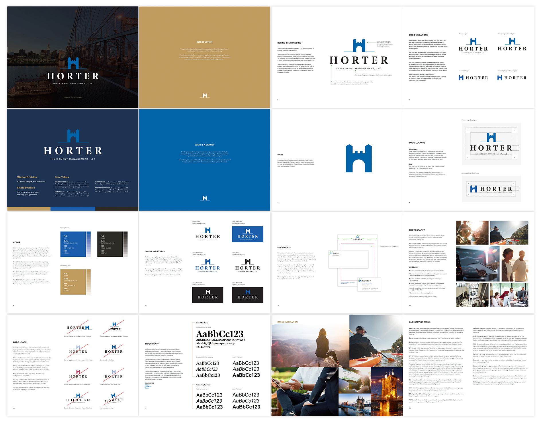
The Horter logo ties together ideas of strength, heritage, and stability. The Horter “H” captures their Cincinnati headquarter’s architecture and connects it to the iconic Roebling Suspension Bridge.
Brand Guidelines
As part of the rebranding, we also provided a detailed brand guidelines document covering everything from the application of the logo to the selection of photography. Brand standards like these are a powerful way to bring alignment to your marketing and organization, especially after rebranding.
Website Design and Development
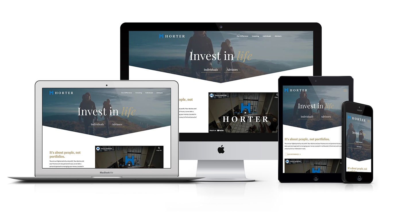
The old Horter website was crippled by its WordPress back-end and plagued with issues. With the new branding in place, we guided the Horter marketing team through our website design and development and created a custom-designed site, hand-coded on Craft CMS so that they can easily manage their content.
Homepage
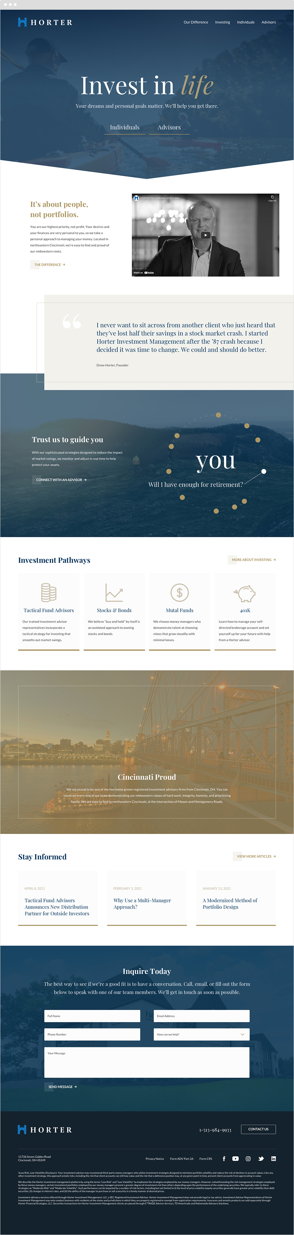
The Horter homepage greets users with their investment philosophy "Invest in life" and allows users go directly to content tailored for individuals or investment advisors.
Real Client Review
We pride ourselves on being best in class. By partnering with Antistatic we got to another level.
Jack Peters, Executive Vice President, Horter Investment

Our Difference Page
The Our Difference page showcases their unique approach to investment and allows users to navigate deeper into recent news, leadership profiles, and more.

Related Work