Simply put, a responsive website is one that adapts its form to the device of the user. This happens automatically without the user's interaction and provides them with an appropriate user experience for their device.
What are the keys to Responsive Website Design
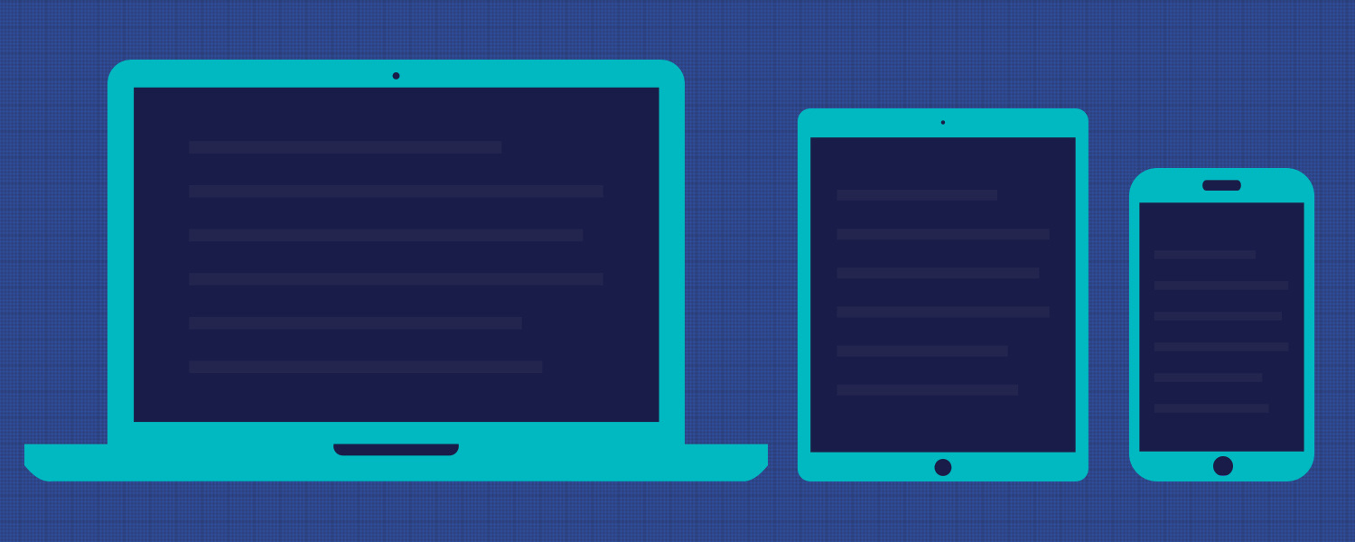
A responsive website looks good and works well on mobile phones, tablets, other alternative screens as well as traditional laptops and desktop computers.
A responsive website works properly whether the user is on a touch device or is using a mouse.
A responsive website follows the philosophy of publishing once, for all devices. No separate mobile site or another system to maintain. One website, one content management system. Simple and streamlined.
Why does responsive website design matter?
Gone are the days of expecting traffic from only a desktop computer. A vast majority of your website's users will come from smartphones and tablets. A much as 57% of all US online traffic comes from a phone or tablet - that could be half your site's traffic!
A responsive website should be one that is optimized for speed and load quicky for the user which matters to Google. Google is now ranking site speed as a key factor in their algorithm. Similarly, they have now included mobile-friendliness as a factor as well making it all the more important that your website is responsive.
Finally, a responsive website ensures that your site's visitors have a similar experience on all devices - but one that is tailored to the device they are using. They experience your website without frustration.
Real Client Review
From start to finish, each phase of the process was smooth and the attention we received was excellent. Their ideas were fresh, powerful, and creative!
