After growing steadily through the startup phase, GivingThree approached us in need of a fully refined brand identity.
GivingThree works with non-profits to help them reach their fundraising goals through a threefold strategy, offering consulting, teaching, and planning.
As part of their brand development we worked to define their unique brand DNA, explored several concepts and landed on the unique G3 arrow as their new brand mark. Included in the project project we created the final logo files, guidelines, stationery, business cards, website and more.
Final Logo Design
After exploring several concepts, we presented the client with the refined logo and they loved it!
Antistatic Design is a valued thought partner and played a critical role as GivingThree searched for a consistent brand identity. In working with Mark Wells on our brand and website project he lived up to his own brand standard—he helped make the promise of GivingThree stand out and without static. The result has helped our message be heard loud and clear among a crowded field of competition. Mark and the Antistatic team helped convert a broad vision (and a lot of notes and research) into a consistent standard that continues to perform well in both print and digital.
Ben Mohler, Chief Executive - GivingThree
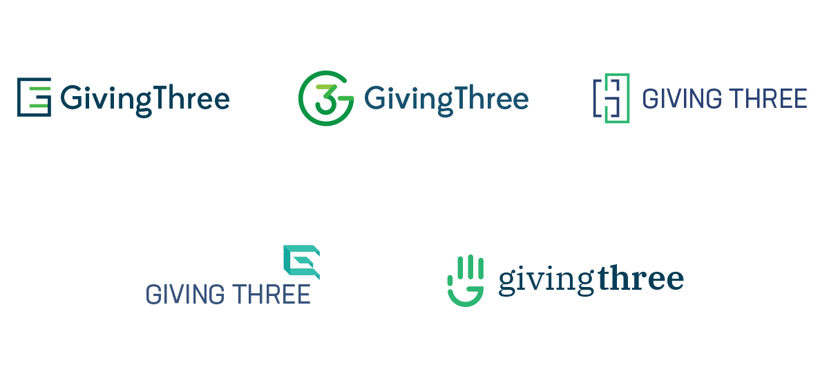
Logo Concept Exploration
We began the logo design process with a pencil and paper, and eventually worked out the following concepts for review with the client.
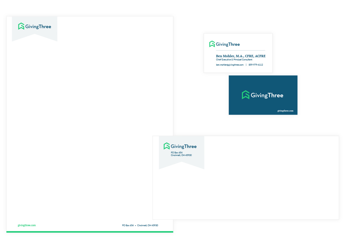
Stationery System
We created a stationery system including business cards, letterhead and number 10 envelope for the client as part of the project.
Ready to talk about your branding or website project? Take a moment and tell us all about it.